2015 Pantone Spring Color Report and Why it is Important
Part of being a market leader is staying current with trends and new products. Our strategy for keeping Party Reflections a market leader is to always be looking for new ideas and information that is on the horizon. We watch the textile market and its trends. We look to fashion and home décor to find how people are being inspired. We use social media to develop dialogue between businesses and share when these event designs actually take place. Currently, it is important to know that during Fashion week, the Pantone Color Institute released their color predictions for spring of 2015.
“En Plein Air” http://www.pantone.com/pages/fcr/?season=spring&year=2015&pid=11
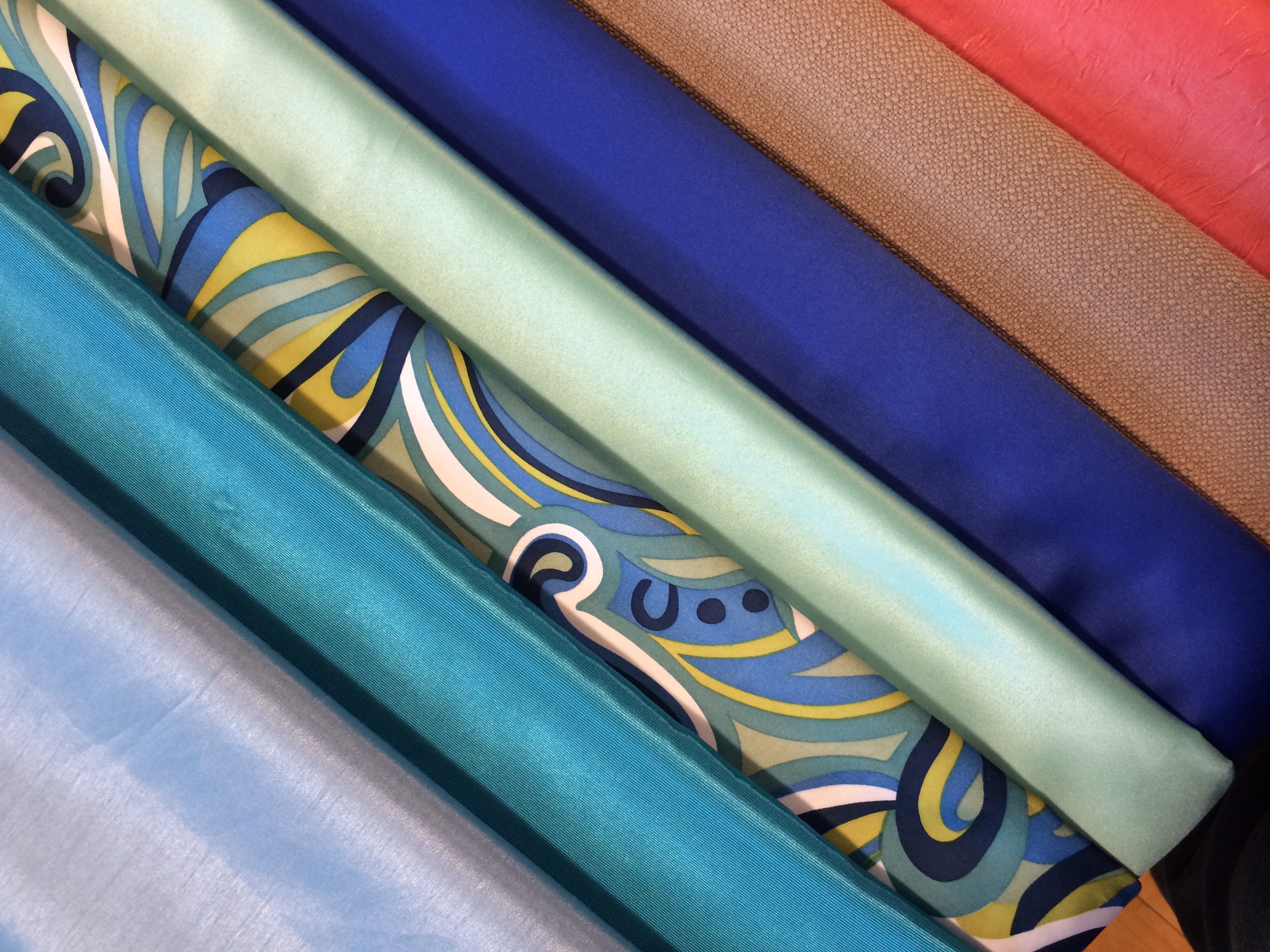
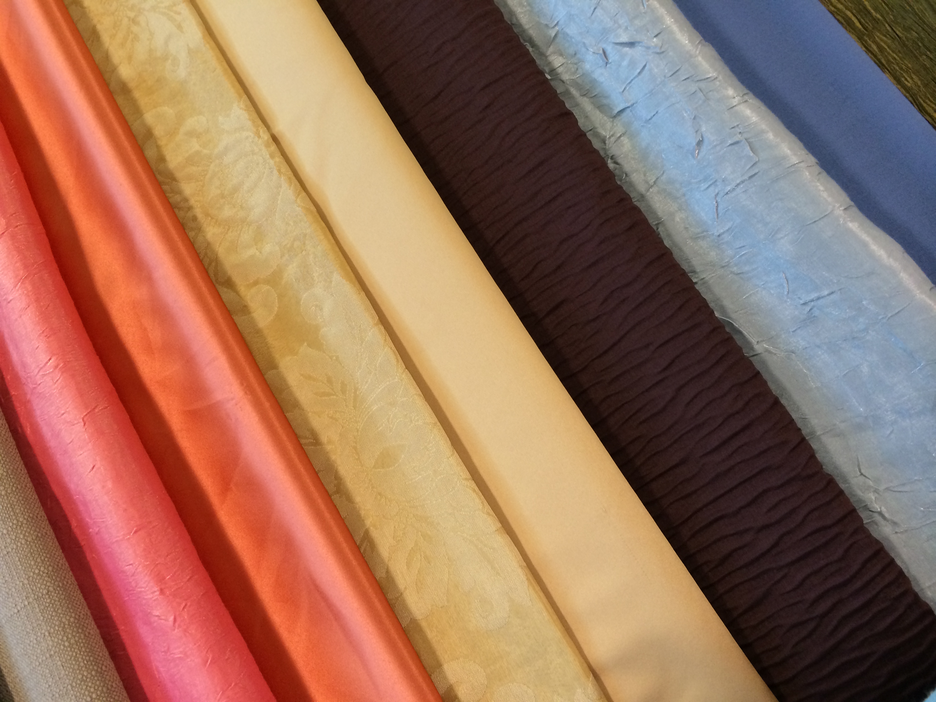
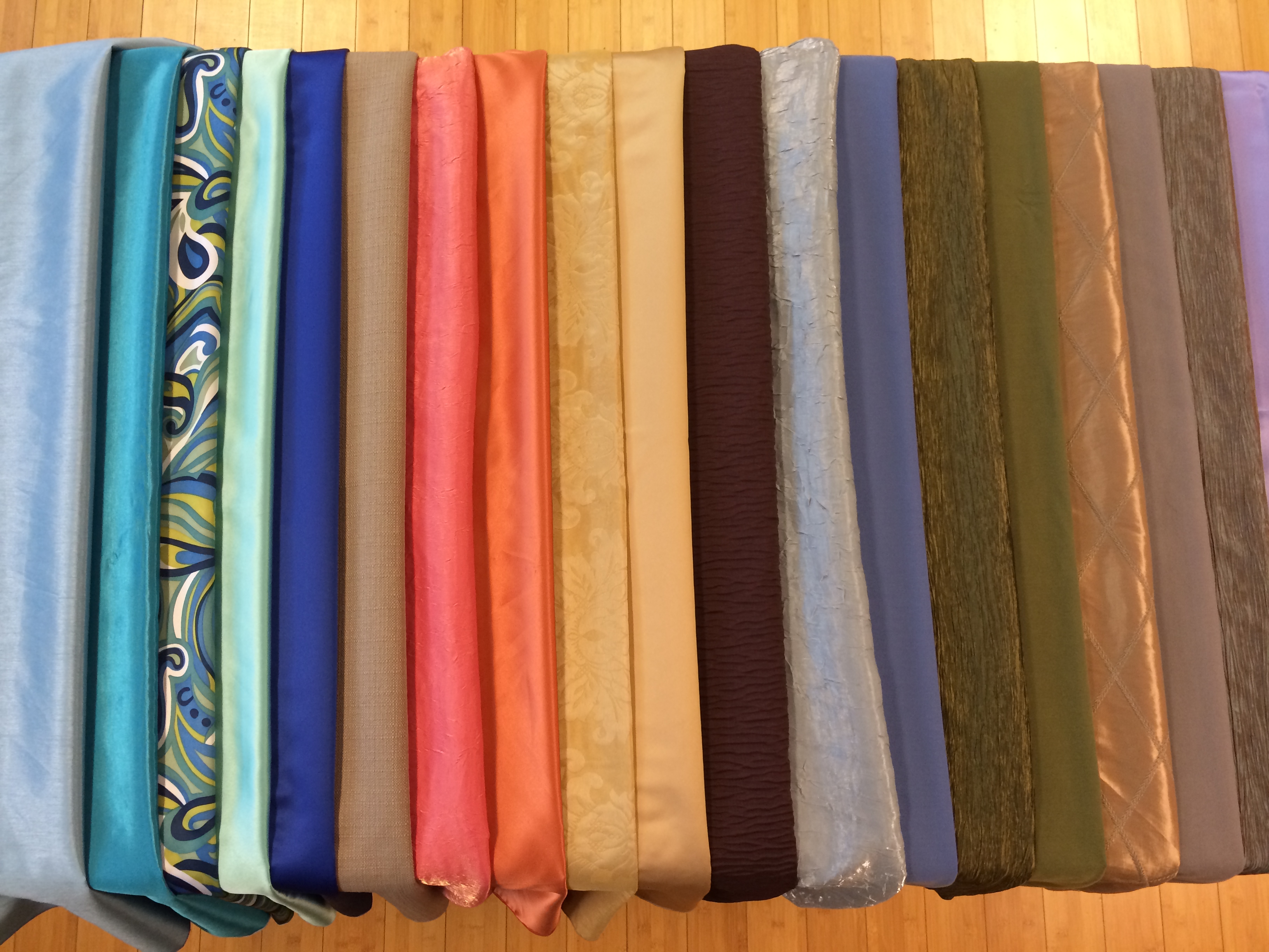
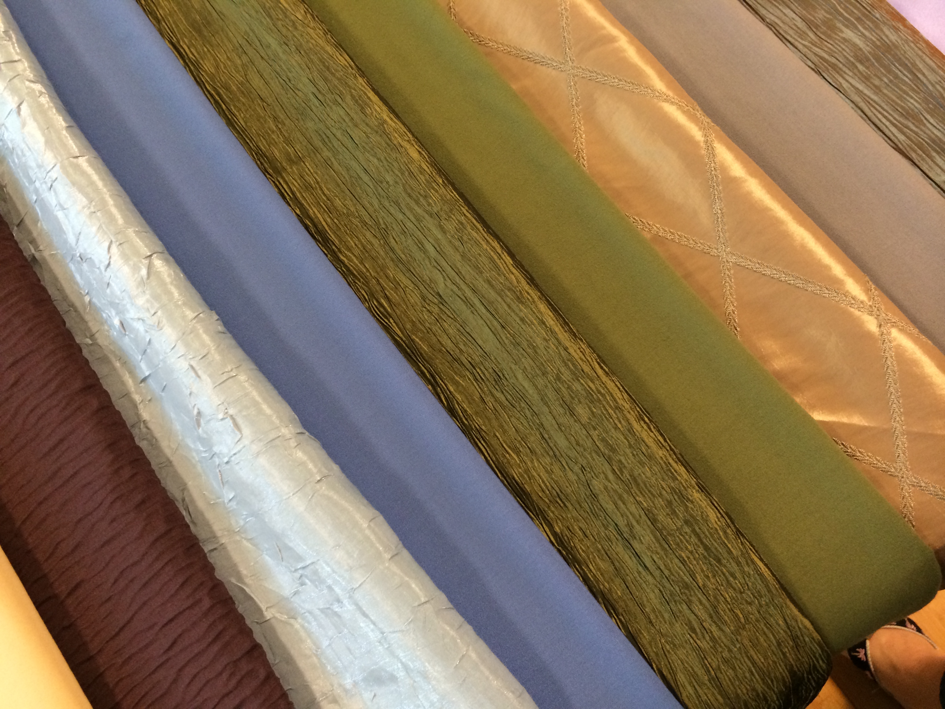
This season there is a move toward the cooler and softer side of the color spectrum. An eclectic, ethereal mix of understated brights, pale pastels and nature-like neutrals take center stage as designers draw from daydreams of simpler times. Remembrances of retro delights, folkloric and floral art, and the magical worlds of tropical landscapes restore a sense of well-being as we head into warmer months.
“Many feel compelled to be connected around the clock because we are afraid we’ll miss something important. There is a growing movement to step out and create ‘quiet zones’ to disconnect from technology and unwind, giving ourselves time to stop and be still. Color choices follow the same minimalistic, ‘en plein air’ theme, taking a cue from nature rather than being reinvented or mechanically manipulated. Soft, cool hues blend with subtle warm tones to create a soothing escape from the everyday hustle and bustle.”
Leatrice Eiseman Executive Director, Pantone Color Institute®
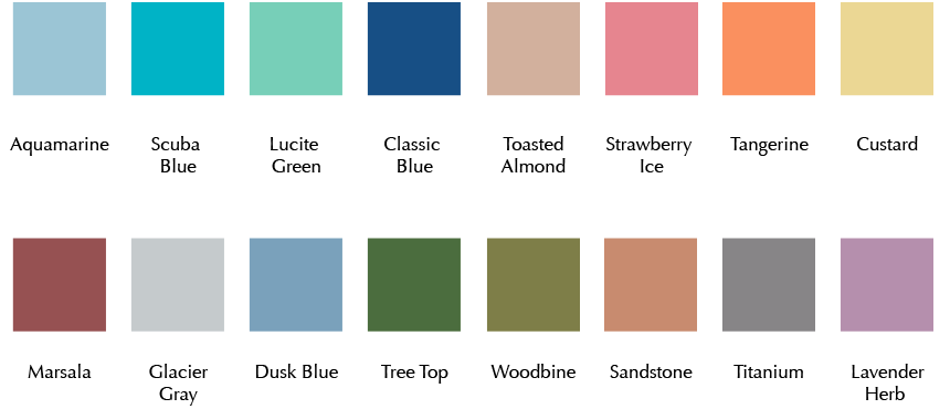
If you are not familiar with this color prediction of trends, let us introduce you to the “Pantone gods.” Pantone is a universally recognized system of color matching as it applies to all things visual and design focused. The number sequence they assign to given colors is recognized by the PMS (pantone matching system) number. For example, our Party Reflections logo is perfectly matched to PMS360. If we refer to that in print materials or truck wraps, it will consistently be the same color green. At Pantone, they are completely focused on color trends as it applies to fashion and home as well as graphic design. They are the trend setting gods that tell you what to expect in these realms. Each year they choose a Color of the Year to look for and will be the “hottest thing going.” In 2013 the color was Emerald Green, PMS175641. If you recall, there were all types of influence in the market place. We saw emerald green shoes, purses, dresses and jewelry. In general jewel tones could be seen in all forms of the textile and fashion industry. Once again, the influence of the “gods” choice was seen in the prediction for the Color for 2014: Radiant Orchid, PMS 18-3224.
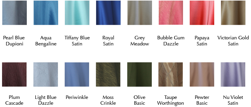
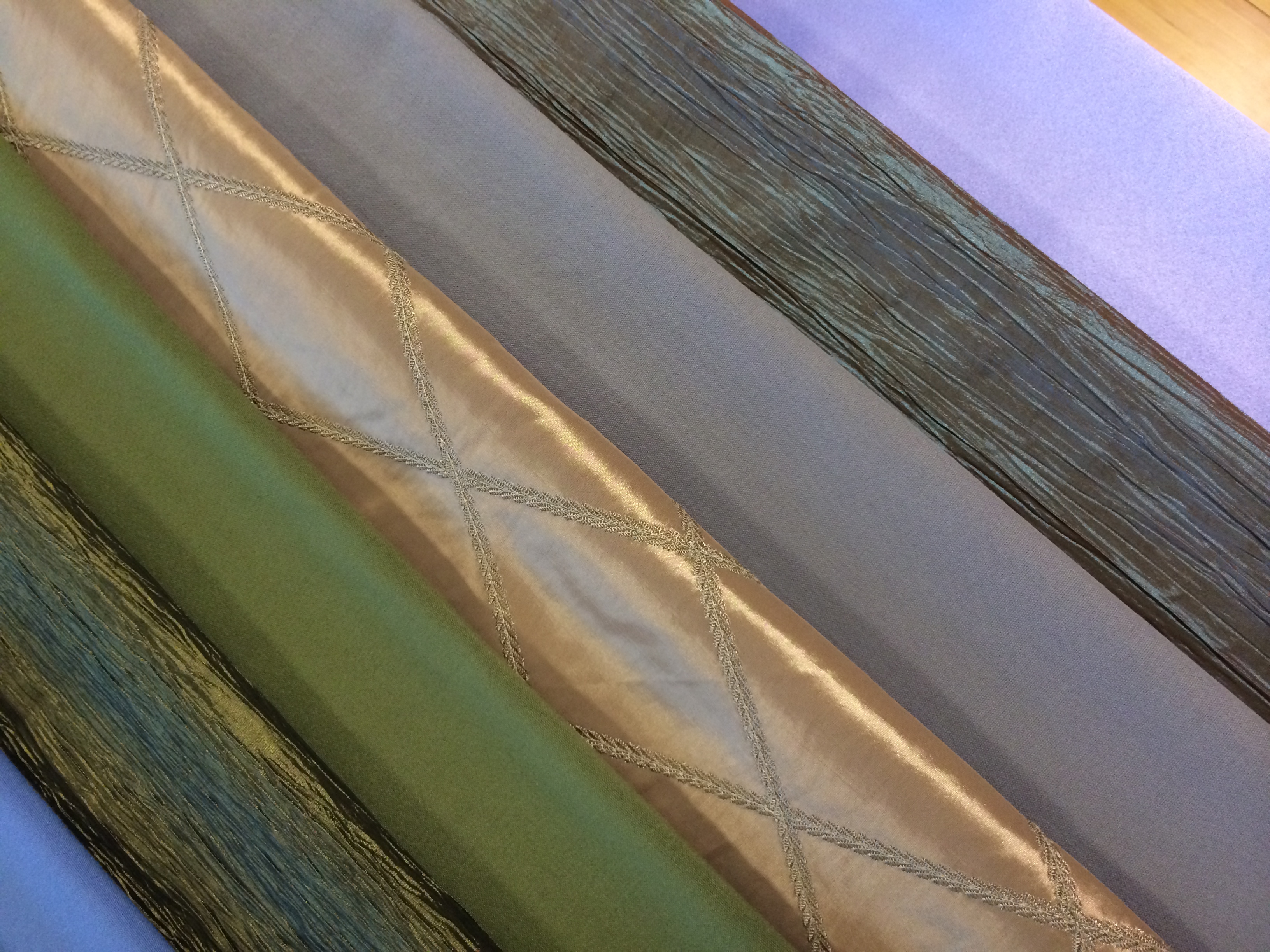
With the release of the 2015 Spring Color Report, our Creative Director, Maurisa Beaver pulled samples of these color tones from our existing linen inventory. There are so many options that you can find in The Linen Gallery that can add these color influences in your event design. Not only are there like colors, but there are textures that can add another design element to your vision.
As these predictions and trends are so very interesting to watch, the latest event trend will never sway someone away from what they have dreamed of. Most brides choose their wedding colors based on what they love and if they have always wanted a pink wedding, then no amount of Emerald Green will draw them away. It is always important to know what is on the horizon, but you must never lose sight of the client and their needs.
Event professionals and clients alike use Pinterest to generate ideas, to create inspiration boards and to follow trends. That makes Pinterest a great platform for Party Reflections to showcase our inventory in a visual way. Our 2015 Pantone Spring Color Trend board is a resource dedicated to sharing ideas on how you can use these colors in your event design next week or next year.
Regardless of what stage you are in the planning process, Party Reflections strives to be your one-stop rental headquarters for all of your special event rental needs. Follow all of our boards on Pinterest by going to our profile http://www.pinterest.com/partyreflection/. Search The Linen Gallery inventory on our web site partyreflections.com where it is organized by color. Visit the showrooms in Charlotte, Raleigh or Columbia to actually see the product offering and utilize our design centers to build your masterpiece. Be Inspired!